📚 Documentation
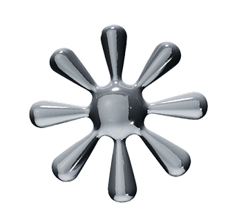
Everything you need to add stunning 3D shapes to your React app
🚨 **CRITICAL:** I have a premium 3D React component called **Shape64** that I've already purchased. DO NOT create a new component from scratch. You MUST use the existing Shape64.tsx file I provide.

## FIRST: Visual Editor Configuration (Optional)

Before we start, did you configure this shape in our visual editor at 3dui.design? If so, please share:

1. **What settings did you choose?** (copy/paste your configuration or describe the colors, materials, animations you selected)
2. **Do you have generated code from the editor?** (if yes, we can use that as a starting point)

If you didn't use the visual editor, that's fine - I'll help you configure it manually, or you can use the default settings.

### Component Overview
- ✅ **Fully-featured 3D shape component** with advanced capabilities
- ✅ **Ready to use** - all files included and configured
- ✅ **12 Material presets**: basic, matte, chrome, glass, metal, plastic, rubber, ceramic, gold, glow, wireframe, toon
- ✅ **Complex animations**: float, slide, spin, pulse, scaleIn, fadeIn, slideIn
- ✅ **LookAt feature**: Mouse tracking with sensitivity, smoothing, dead zone, global/invert options
- ✅ **Hover effects**: glow, scale, color, rotate
- ✅ **Environment presets**: studio, sunset, dawn, night, forest, apartment, city, park, lobby
- ✅ **Error boundaries**: Built-in error handling and loading states
- ✅ **Auto-scaling**: Automatic centering and sizing with immediate effect
- ✅ **TypeScript support**: Full type definitions included

## CRITICAL: Ask WHERE to place component (MANDATORY - Keep asking until answered!)

**🚨 YOU MUST ASK THIS FIRST and get a clear answer before proceeding:**

"Where would you like to integrate this 3D component? **I need to adapt the layout accordingly** and cannot proceed without this information:

1. 🏠 **Hero section** (full viewport width/height)
2. 📦 **Product showcase** (centered, medium size)
3. 🃏 **Card/grid item** (small, constrained size)
4. 📱 **Sidebar/widget** (compact vertical space)
5. 🎨 **Background element** (behind content)
6. ⚙️ **Custom location** (please describe)

Also, do you want it to be the **main focal point** of the page, or more of a **subtle background element**? This helps me choose the right size and animation settings."

**⚠️ IMPORTANT:** If the user doesn't answer this question or gives a vague response, **ASK AGAIN** until you get a specific answer. Do not proceed with integration until you know exactly where this component will be placed.

## Step 1: File Placement Check (CRITICAL)

⚠️ **CRITICAL CHECK:** Before doing anything, verify that I have the Shape64.tsx file in my project.

**Look for this file structure:**
```
📁 my-project/
├── 📁 src/
│   ├── 📁 components/
│   │   ├── Shape64.tsx ← **THIS FILE MUST EXIST**
│   │   └── ... other components
│   └── ...
├── 📁 public/
│   ├── 64.glb ← **THIS FILE WILL BE PLACED HERE**
│   └── ...
└── ...
```

**If Shape64.tsx is missing, STOP immediately and tell me:**

"🚨 **CRITICAL CHECK FAILED:** I don't see the Shape64.tsx file in your components folder.

**📁 Required File Structure:**
```
📁 your-project/
├── 📁 src/
│   └── 📁 components/
│       └── ➡️ **Place Shape64.tsx HERE** ⬅️
└── 📁 public/
    └── ➡️ **Place 64.glb HERE** ⬅️
```

Please make sure you've copied the **Shape64.tsx** file from your purchase to your **src/components/** folder first. I cannot create this component from scratch as it's a premium component with advanced features."

**Do not proceed until this file exists.**

## Step 2: Browse project structure first
Before making any changes, please browse through my project files to:
- Verify this is a React/Next.js project
- Check if @react-three/fiber is already installed
- Look at the existing component structure
- Confirm Shape64.tsx is in the components folder

## Step 3: Install dependencies (CRITICAL - Use correct flag!)

Check package.json first, then install only what's missing:

**⚠️ IMPORTANT:** Use the `--legacy-peer-deps` flag to avoid version conflicts:

```bash
npm install @react-three/fiber @react-three/drei three @types/three --legacy-peer-deps
```

**Why --legacy-peer-deps?** This prevents conflicts with date-fns and other dependencies in some Next.js projects.

## Step 4: Place the model file correctly

**📁 File Placement (VISUAL GUIDE):**
```
📁 your-project/
├── 📁 src/
├── 📁 public/  ← **PLACE FILE HERE**
│   ├── 64.glb  ← **YOUR MODEL FILE**
│   ├── favicon.ico
│   └── ... other public assets
└── ...
```

**⚠️ CRITICAL:**
1. **Place 64.glb** directly in the **public/** folder (NOT in a subfolder)
2. **Path should be:** `/64.glb` (component handles this automatically)
3. **Do NOT** put it in `public/models/` or any subfolder

## Step 5: CRITICAL FIXES for Common Issues

**🔧 The Shape64.tsx file should already include these fixes, but if you see any errors, apply these solutions:**

### Fix 1: React Import Issue
If you see: `Unexpected token 'div'. Expected jsx identifier`

**Fix:** Ensure the first line is:
```tsx
import React, { Suspense, useState, useRef, useEffect } from 'react'
```

### Fix 2: Canvas onCreated Syntax
If you see: `Unexpected token, expected "}}"`

**Fix:** Correct onCreated syntax:
```tsx
onCreated={({ gl, camera, scene }) => {
  camera.updateProjectionMatrix()
  gl.render(scene, camera)
}}
```

### Fix 3: Loading Fallback (Three.js mesh, not DOM)
The LoadingFallback should use Three.js mesh, not DOM elements:
```tsx
function LoadingFallback() {
  return (
    <mesh>
      <boxGeometry args={[0.5, 0.5, 0.5]} />
      <meshStandardMaterial color="gray" opacity={0.3} transparent />
    </mesh>
  )
}
```

## Step 6: Create ADAPTIVE integration with perfect sizing

## 📐 Recommended Container Sizes

**✅ OPTIMAL SIZES (prevent clipping and ensure visibility):**
- **🏠 Hero Section**: `h-screen w-full` (full viewport)
- **📦 Product Showcase**: `h-[800px] max-w-6xl` (large, impressive)
- **🃏 Card/Widget**: `h-[600px] max-w-4xl` (medium, balanced)
- **📱 Sidebar**: `h-[400px] w-full` (compact but visible)
- **🎨 Background**: `absolute inset-0` (full container)

**⚠️ AVOID these sizes (too small, cause clipping):**
- `h-64` (256px) - ❌ Model gets clipped
- `h-48` (192px) - ❌ Too cramped
- `h-96` (384px) - ❌ Barely adequate

**🏠 For Hero sections:**
```tsx
<div className="w-full h-screen">
  <Shape64 {/* props */} />
</div>
```

**📦 For Product showcase:**
```tsx
<div className="w-full h-[800px] max-w-6xl mx-auto">
  <Shape64 {/* props */} />
</div>
```

**🃏 For Cards/Grid items:**
```tsx
<div className="w-full h-[600px] max-w-4xl">
  <Shape64 {/* props */} />
</div>
```

**📱 For Sidebar/Widget:**
```tsx
<div className="w-full h-[400px]">
  <Shape64 {/* props */} />
</div>
```

**🎨 For Background element:**
```tsx
<div className="absolute inset-0 -z-10">
  <Shape64 {/* props */} />
</div>
```

## 🎯 WORKING INTEGRATION EXAMPLE

**This is the complete, tested integration that works perfectly on first try:**

```tsx
// pages/index.tsx or app/page.tsx
import Shape64 from './components/Shape64'

export default function App() {
  return (
    <div style={{ width: '100vw', height: '100vh' }}>
      <Shape64
        color="#ffffff"
        material="chrome"
        float
        spin
        onHover="color"
        hoverColor="#3b82f6"
        userCanRotate
      />
    </div>
  )
}
```

**✅ This example includes:**
- ✅ Full viewport container (100vw x 100vh)
- ✅ Optimal scale (0.5 built-in - prevents clipping)
- ✅ Chrome material (professional appearance)
- ✅ Explicit float animation (user adds `float` prop)
- ✅ Explicit spin animation (user adds `spin` prop)
- ✅ Explicit hover effects (user adds `onHover="color"`)
- ✅ User rotation control (user adds `userCanRotate`)
- ✅ Custom hover color (user sets `hoverColor="#3b82f6"`)
- ✅ Shadows disabled (built-in - no ground shadow)
- ✅ Optimal camera positioning (built-in - z=6, fov=75)

## Complete Props Reference
```tsx
<Shape64
  // Appearance
  color="#ef4444"                    // Hex color code
  material="chrome"                  // Material preset
  scale={1.5}                      // Size multiplier
  environment="studio"               // Lighting preset
  position={[0, 0, 0]}             // 3D position [x, y, z]
  tilt={[0, 0, 0]}                 // Rotation [x, y, z] degrees

  // Animations
  float                              // Gentle up/down animation
  slide                              // Side-to-side animation
  spin                               // Continuous rotation
  pulse                              // Breathing scale effect
  scaleIn                            // Entrance from large
  fadeIn                             // Entrance from transparent
  slideIn                            // Entrance from left
  spinDirection="y"                  // Rotation axis: x, y, z
  spinWithTilt                       // Add secondary rotation
  rotateSpeed={2}                  // Speed multiplier
  slideSpeed={1.5}                 // Slide animation speed
  floatIntensity={0.3}             // Float strength
  slideIntensity={0.2}             // Slide strength

  // LookAt (mouse tracking)
  lookAt                             // Enable mouse tracking
  lookAtSensitivity={0.7}          // How strongly it follows (0-1)
  lookAtSmoothing={0.5}            // Transition smoothness (0-1)
  lookAtDeadZone={0.2}             // Center area stays neutral (0-1)
  lookAtGlobal                       // Track across entire window
  lookAtInvert                       // Look away from mouse

  // Hover effects
  onHover="glow"                     // none, glow, scale, color, rotate
  hoverColor="#3b82f6"               // Color for hover effects

  // Interaction
  userCanRotate                      // Enable mouse rotation controls
  onClick="https://example.com"      // URL to open when clicked

  // Canvas settings
  enableControls={true}            // Show orbit controls
  className="shadow-2xl"             // CSS classes for container
/>
```

## 🎨 Easy Customization Options

After integration, you can easily customize the Shape64 component by **adding props**:

### Method 1: Manual Props (Add Effects)
Add these props to enable animations and interactions:
- **Materials**: `material="chrome"` (chrome, glass, metal, plastic, rubber, ceramic, gold, glow, wireframe, toon)
- **Colors**: `color="#ef4444"` (any hex color like #ef4444 red, #10b981 green, etc.)
- **Animations**: `float`, `slide`, `spin`, `pulse`, `scaleIn`, `fadeIn`, `slideIn`
- **Environments**: `environment="sunset"` (studio, sunset, dawn, night, forest, apartment, city, park, lobby)
- **Hover Effects**: `onHover="color" hoverColor="#3b82f6"` (none, glow, scale, color, rotate)
- **User Controls**: `userCanRotate` (enables mouse rotation)

### Method 2: Visual Editor (Easiest Way)
💡 **Pro Tip:** For even easier customization, go to [3dui.design](https://3dui.design), configure your shape visually with the editor, copy the generated code, and replace your current Shape64 component code. It will work perfectly with the same 64.glb file!

## Final Step: Adaptive Integration
After I tell you where to place this component:
1. **Suggest the best parent container size** for my chosen location
2. **Show me the complete integration code** into my existing page/component
3. **Provide responsive breakpoints** if needed
4. **Test that the canvas adapts** to the container size properly
5. **Ensure auto-scaling works immediately** without requiring user scroll

## Key Features Included:
- ✅ Auto-scale and center 3D models (immediate effect, no scroll needed)
- ✅ Error handling with helpful error messages
- ✅ Loading fallback during model loading (Three.js mesh, not DOM)
- ✅ Support for all 12 material types with proper Three.js materials
- ✅ Smooth animations at 60fps
- ✅ Click-to-link functionality
- ✅ Hover effects (glow, scale, color, rotate)
- ✅ Mouse tracking (LookAt feature)
- ✅ Responsive design
- ✅ TypeScript support
- ✅ Backward compatibility with legacy props

### Important Notes:
- ✅ This is a **PREMIUM component** with ALL advanced features already built-in
- ✅ No need to create base components or add missing features
- ✅ Focus on integration and configuration, not rebuilding functionality
- ✅ Component supports both new props and legacy props for backward compatibility
- 🚨 **MUST use the existing Shape64.tsx file - do not create from scratch**
- 📁 **Place 64.glb directly in public/ folder** (not in subfolders)
- ⚠️ **Use --legacy-peer-deps flag** when installing dependencies
- 🎯 **Progressive integration:** Start simple, confirm it works, then enhance

## 🚨 If You Encounter Issues

**Common Error: "Unexpected token div"**
→ Fix: Add React to imports: `import React, { ... } from 'react'`

**Common Error: "Unexpected token, expected '}}'"**
→ Fix: Use correct onCreated syntax: `onCreated={({ gl, camera, scene }) => {`

**Common Error: "R3F: Div is not part of THREE namespace"**
→ Fix: LoadingFallback uses Three.js mesh, not DOM elements

**Common Error: Model appears as green box**
→ Fix: Use Stage preset="rembrandt" and Environment background={false}

**Common Error: Model too large/small or changes size on scroll**
→ Fix: Auto-scaling logic uses scene object and fixed dependencies

**Common Error: Dark materials**
→ Fix: Proper lighting with Stage and Environment components

**Common Error: Model barely visible or clipped**
→ Fix: Use larger containers (h-[600px]+) and scale={0.5}

**Common Error: Unwanted ground shadows**
→ Fix: Add shadows={false} to Stage component

Please implement this step-by-step and let me know if you need any clarification about my specific configuration.
💡 Paste this into ChatGPT, Claude, or any AI assistant to get help with your 3D components!
Install Dependencies
npm install -D @types/three
Place Your Files
📁 Step 2a: Place the Shape**.tsx component file
Copy Shape**.tsx (where ** is your shape number) to your src/components/ folder
Example: src/components/Shape64.tsx
📁 Step 2b: Place the .glb model file
Place your **.glb model file in the public/ folder
Example: public/64.glb
Use Your Shape
Copy this code and paste it into your React app
Your Code
Copy this into your React app
import Shape64 from './components/Shape64';
export default function App() {return (<div style={{ width: '350px', height: '350px', zIndex: 9999, pointerEvents: 'auto' }}><Shape64
modelPath="64.glb"autoScale={false}color="#ffffff"material="chrome"scale={0.42}scaleInslideInspinonHover="color"hoverColor="#3b82f6"userCanRotate
/></div>);}💡 Tip: Customize your shape on the main page with colors, animations, and materials, then copy the generated code for your exact configuration
Required Props
modelPath: stringPath to your .glb file
Appearance
color?: stringHex color code (default: "#ffffff")
material?: "basic" | "matte" | "chrome" | "glass" | "metal" | "plastic" | "rubber" | "ceramic" | "gold" | "glow" | "wireframe" | "toon"Material preset for realistic rendering
scale?: numberSize multiplier (default: 1)
environment?: "studio" | "sunset" | "dawn" | "night" | "forest" | "apartment" | "city" | "park" | "lobby"Lighting environment preset (default: "studio")
Position & Transform
position?: [number, number, number]3D position [x, y, z] (default: [0, 0, 0])
tilt?: [number, number, number]Rotation in degrees [x, y, z] (default: [0, 0, 0])
Basic Animations
spin?: booleanContinuous rotation animation
float?: booleanGentle up/down movement
slide?: booleanSide-to-side movement
pulse?: booleanBreathing scale effect
Animation Controls
rotateSpeed?: numberRotation speed multiplier (default: 1)
slideSpeed?: numberSlide animation speed (default: 1)
floatIntensity?: numberFloat animation strength (default: 0.2)
slideIntensity?: numberSlide animation strength (default: 0.2)
Spin Controls
spinDirection?: "x" | "y" | "z"Axis of rotation (default: "y")
spinWithTilt?: booleanAdd subtle secondary rotation (default: true)
Entrance Effects
scaleIn?: booleanScale in from large to normal size
fadeIn?: booleanFade in from transparent to opaque
slideIn?: booleanSlide in from the left
Hover Effects
onHover?: "none" | "glow" | "scale" | "color" | "rotate"Hover effect type (default: "none")
hoverColor?: stringColor for hover effect (default: "#ffffff")
Interactions
onClick?: stringURL to open when clicked
userCanRotate?: booleanEnable mouse rotation controls (default: false)
LookAt Feature
lookAt?: booleanShape follows mouse cursor
lookAtSensitivity?: numberHow strongly it follows mouse (0-1, default: 0.5)
lookAtSmoothing?: numberHow smoothly it transitions (0-1, default: 0.5)
lookAtDeadZone?: numberCenter area where it stays neutral (0-1, default: 0.5)
lookAtGlobal?: booleanTrack mouse across entire window (default: false)
lookAtInvert?: booleanLook away from mouse instead of toward it (default: false)
Component Props
className?: stringCSS classes for the container
enableControls?: booleanShow orbit controls (default: true)
❌ Model not showing / blank screen
- • Check that your .glb file is in
public/folder - • Verify the modelPath matches exactly:
"/yourfile.glb" - • Check browser console for Three.js errors
⚠️ Model too big/small or off-center
- • Go to the Transform tab on the landing page to adjust size and position exactly how you want
- • Use the
scaleslider to resize the model - • Use the
positionsliders to move it left/right, up/down, near/far - • Use the
tiltsliders to rotate it to the perfect angle - • Once adjusted, copy the updated code with your exact settings
📬 Stay Updated
Get notified about new shapes, features, and documentation updates